14. Form Field Labels
Associate every form element with a label
Tie each user input control (e.g. text field, radio button, pull-down menu) to text that describes the purpose of the control, using conventions for the media type.
Rationale
When a form field lacks an explicit label, screen readers will try to figure out which onscreen text labels the field. Sometimes they can’t find any appropriate text, in which case the screen reader speaks no label at all. And, sometimes, the screen reader guesses the wrong label.
The techniques for this guideline explain how to use markup and other technology features to explicitly associate text labels with corresponding form elements in a way that screen readers will recognize. Explicit labels ensure that screen reader users will understand which form elements are associated with which labels. This way, they can be confident that they are entering information using the correct form fields.
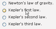
Also, in HTML and Flex, many browsers use explicit labels to give users easier mouse access to radio buttons and check boxes. Clicking anywhere on the label can select and de-select the form elements. This is particularly helpful for people with minor mobility or dexterity issues.
HTML & JavaScript
Quick Look!
Usually use: <label for=“my_id”>My Label</label> <input type=“text” id=“my_id”>
If there is no onscreen text use: title=“My Label”
If the onscreen text is in two places, use: aria-labelledby=“my_id1 myid_2”
Forms Fields with Text Labels
When form elements (e.g. checkboxes, radio buttons, select menus, text fields, and text areas) have onscreen text that tells the user the purpose of the form element, give the form field an id attribute. Then wrap the prompting information with the <label> tag. The value of the for attribute of the <label> tag should match the value of the id attribute of the form control.

<label for=“q4”>A ball is moving in a vertical circle with a
radius of 0.76 meters. Its speed is 5.3 m/s at the top. To the
nearest tenth of a m/s2, what is its acceleration at the top?</label>
<input type=“text” id=“q4”>
Form Fields Labeled by an Image
If an image is used as the onscreen label, the image tag (with alt-text) should be associated with the form element using the <label> tag:
![]()
<label for=“search”>
<img scr=“search.gif” alt=“Site Search:”>
</label>
<input type=“text” id=“search”>
Form Fields without Onscreen Labels
When form elements (e.g. text fields, select menus, and text areas) do not have onscreen text that tells the user the purpose of the form element, or if that prompting information is coming from more than one place, a title attribute that provides this information should be added to the form element.
![]()
<input type=“text” title=“Search Terms” />![]()
Phone Number:
<input type=“text” name=“areacode” size=“3” title=“Phone Number Area Code”>
<input type=“text” name=“three” size=“3” title=“Phone Number Three Digits”>
<input type=“text” name=“four” size=“4” title=“Phone Number Last Four Digits”>
Form Fields with Two or more Onscreen Labels
Sometimes form elements (e.g. text fields, select menus, and text areas) are labeled by two or more bits of text that are separated by other HTML elements. While two or more label for=“my_id” elements, each referencing the same id, are supposed to work for this, this is not reliable. The new WAI-ARIA attribute aria-labelledby, however, allows you to use a list of space-separated ids as the value. This is the best supported technique to use today, as of December 2013.
<label id=“c1”>Credit Card:</label>
<input type=“text” aria-labelledby=“c1 c2” />
<label id=“c2”>(Visa, Discover, or Master Card)</label>
Screen readers will read the labels in the order that their ids are listed in the aria-labelledby attribute.
Labels for Groups of Form Fields
If your radio buttons or checkboxes need a group label to be understood, use fieldset and legend tags to associate the group label with the form fields:

<fieldset>
<legend>Is this a gift?</legend>
<input type=“radio” id=“y” /> <label for=“y”>Yes</label>
<input type=“radio” id=“n” /> <label for=“n”>No</label>
</fieldset>
Screen readers will present the legend when the user tabs to the group of form fields.
Long Labels for Groups of Form Fields as Occur in Quizzes
Some screen readers will read the legend with each form control. If the group label is too long (over 25 words) to be heard with each form field, mark the group label as a heading.
In quizzes, pay attention to consistency. If some questions in a quiz are so long that they need to use headings instead of legends, then all of the questions should use headings instead of legends.
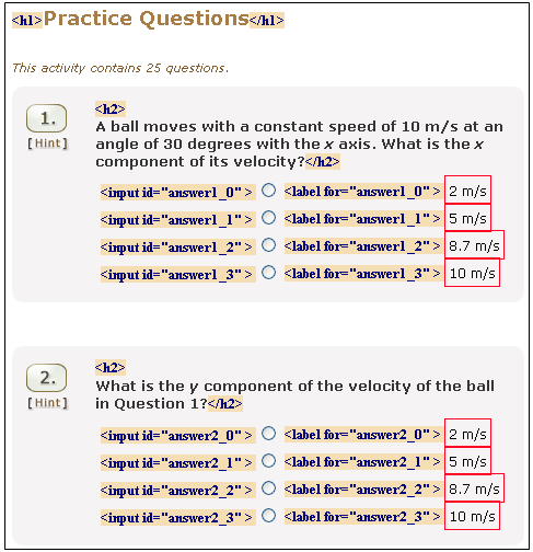
JavaScript for Creating Form Fields with Labels
Include labels or titles, as appropriate, when using the DOM to create new form fields. For example:
/* create a radio button with id */
var myNewRadio = document.createElement("input");
myNewRadio.type = "radio";
myNewRadio.id = "blue";

/* create a label element with for attribute */
var myNewLabel = document.createElement("label");
myNewLabel.htmlFor = "blue";

/* create a text node */
var myLabelText = document.createTextNode(" Blue Car");

/* place text node into the label element */
myNewLabel.appendChild(myLabelText);

/* place radio element on the page */
document.body.appendChild(myNewRadio);

/* place label element on the page */
document.body.appendChild(myNewLabel);
Screen Reader Behaviour Tips
When using the
labelelement, always use theforattribute as described above. Simply enclosing the form field and the text label in thelabelelement does not work in popular screen readers today.It works in all screen readers today but still fails Dragon NaturallySpeaking 13<!– Do Not Use This Code –> <label>Please enter your name <input type=“text” id=“name”> </label>- We recommend avoiding using both a
labelelement and atitleattribute for the same form element, as that can complicate interaction with the form for screen reader users.
HTML Validation Tips
- The value of HTML id attributes must be unique through out each document.
- The value of HTML id attributes should not begin with a number.
Android Applications
All form controls must have a label defined. The method used to define the label for the form field depends on the type of form control.
Label and instruction text MUST be programmatically associated with the input.
Text Inputs
Text inputs must have a visible label connected as the accessible name of the EditText input via the android:labelFor property ID value association.
EditText inputs should not use an android:hint attribute as the only visible label because when the field is filled, TalkBack reads the entered value to the user instead of the hint text and visually the placeholder text will disappear preventing the user from seeing the label name.
Code Example Using android:labelFor ID Connections
    <TextView
android:id=“@+id/textView”
android:labelFor=“@+id/editText2”
android:text=“First Name”/>

<EditText
android:id=“@+id/editText2”
android:hint=“John”
android:inputType=“textPersonName” />
Checkboxes, RadioButtons, Switch Controls
Controls that already have visible text included like Checkboxes, RadioButtons, Switch Controls, etc. MUST use android:text as the connected label that is spoken to TalkBack users on focus.
Native controls that don’t include visible android:text properties, e.g. SeekBar sliders, will have to use android:labelFor method to connect label text as their accessible name.
Code Example Using android:text as Label
<CheckBox
android:id=“@+id/checkBox2”
android:text=“I Agree to Terms & Conditions” />
<Switch
android:id=“@+id/switch3”
android:text=“Remember Username”/>
Grouping Form Inputs
Code Example Using android:contentDescription to Add Legend Text
    <TextView
android:id=“@+id/textView4”
android:textColor=“#000”
android:text=“Preferred Contact Method(s)” />

<CheckBox
android:text=“Phone”
android:contentDescription=“Phone, Preferred Contact Method(s)”
android:id=“@+id/checkBox8” />

<CheckBox
android:text=“Email”
android:contentDescription=“Email, Preferred Contact Method(s)”
android:id=“@+id/checkBox9” />

<CheckBox
android:text=“SMS”
android:contentDescription=“SMS, Preferred Contact Method(s)”
android:id=“@+id/checkBox10” />
iOS Applications
Labels MUST Be Visible and Programmatically Associated to Inputs
All form controls MUST have explicit and visible labels. The label is defined using the accessibilityLabel property to name the form control. If there are instructions, examples or other related information for the form field, this can be associated to the form field using the accessibilityHint property.
Code Example Setting TextField .accessibilityLabel Property to Match the Visible UILabel Text
emailTextField.accessibilityLabel = emailLabel.textInput Groups MUST Have a Group Label Programmatically Defined
Code Example Setting Custom Radio Button Controls .accessibilityLabel Property to Include the Visible Group Legend Text
radio5.accessibilityLabel = radio5.accessibilityLabel! + “, ” + legend.accessibilityLabel!
radio6.accessibilityLabel = radio6.accessibilityLabel! + “, ” + legend.accessibilityLabel!
radio7.accessibilityLabel = radio7.accessibilityLabel! + “, ” + legend.accessibilityLabel!
radio8.accessibilityLabel = radio8.accessibilityLabel! + “, ” + legend.accessibilityLabel!
PDF in Acrobat
Form fields within the PDF document allow people with visual impairments easier access to enter data. If there are form fields within the PDF document, Acrobat will display a prompt to highlight them.
If there are no form fields in the document, there is nothing further that needs to be done.
Interactive Form Fields
Creating accessible form fields to a PDF is a multi-step process.
The process is slightly different in each version of Acrobat. In Acrobat 9 Pro, do the following:
- If there are no form fields in the document, use Advanced > Accessibility > Run Form Field Recognition to automatically detect form fields and to make them fillable. Using the form editor, add and edit fields as necessary.
- For each form field in the document, edit the properties using the context menu for the form field and select Properties. Each form field needs an accessible name using the tooltip property.
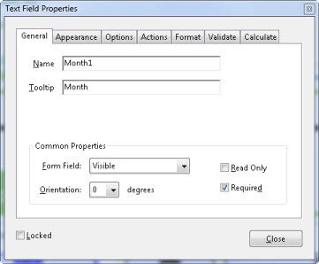
- Add the form fields to the tags tree at Advanced > Accessibility > Add Form Fields to Tags
- Run the Full Accessibility Check at Advanced > Accessibility > Full Check… This will uncover any form fields that were not automatically added to the tags tree.
- For the form fields that were not added, use the TouchUp Reading Order tool to tag the fields as a form field.
- Check the order of the tags. The text prompt should be either before or after the form field based on the visual position on the page.
Required Indicator
The required indicator is set using the form field properties. Access the context menu for the form field and select the Properties dialog. Check the Required checkbox. This will require a user to fill in the selected form field and will present an error message to the user if they do not fill it the field.
Submit Buttons
Creating a submit button is similar to adding new form fields.
To create a button in Acrobat 9 Pro, select Forms > Form Tools > Button from the toolbar and place the button on the page. Next, set the button properties by selecting Properties… from the context menu. Provide the name and a tooltip for the button. In the options tab, select a layout and add the text Submit in the label field to identify the button as a submit button. As the final step, go to the Actions tab and set the Select Trigger to Mouse Up which is keyboard accessible. To define the action to take, select the Add… button and select the appropriate action.
Flash
CheckBoxes and RadioButtons
The simplest way to label Flash CheckBoxes and RadioButtons is to use the native Flash components and use the label parameter to add the onscreen labels. The label parameter can be set through the Component Inspector or through ActionScript. See WCAG 2.0 Technique Flash 29 (opens in new window) for code samples.
To make fully accessible checkBoxes and radioButtons, see also Pearson Guideline 20, which discusses ensuring that screen reader users will know that these are radioButtons and checkBoxes and what their state is (e.g. checked or unchecked).
Flex
TextInputs, TextAreas and Combo Boxes
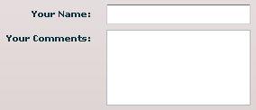
Place your TextInput or TextArea component into a FormItem, which can be assigned a label in Design Mode, in the Properties panel, or in the MXML as shown below. This will be set up for you automatically if you drag a “Form” component onto the stage in design mode and then drag a TextInput or TextArea into that “Form” component.
<mx:FormItem label="Your Name:" fontWeight="bold">
<mx:TextInput/>
</mx:FormItem>
<mx:FormItem label="Your Comments:" fontWeight="bold">
<mx:TextArea height="84"/> </mx:FormItem>
Note that this does not work ideally for Combo Boxes in FlashPlayer currently. When you tab to the ComboBox, you do not hear the label. This is a bug. However, if you use reading commands, the text is read just before the form control. The same issue occurs if you set the Accessible Name directly in Action Script, or if you use a toolTip. However, in these cases the onscreen text and the accessible name are each read, which creates unnecessary noise. So, we see the method recommended above as the best option.
CheckBoxes and RadioButtons
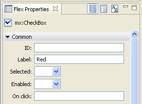
The simplest way to label Flex CheckBoxes and RadioButtons is to use the native Flex components and use the label property to add the onscreen labels. Labels can be set in design mode or in the properties panel. Or they can be added as attributes in the Flex MXML source code:
<mx:CheckBox label="Red" id="myRedCheckBox" />Like any MXML attribute, labels can also be updated or created dynamically, using ActionScript:
myRedCheckBox.label="Yellow";Labels for Groups of RadioButtons or CheckBoxes

If your RadioButtons or CheckBoxes need a group label to be understood, use FormItem to group the buttons and provide a group label. This will be set up for you automatically if you drag a form component onto the stage in design mode, and then drag RadioButtons or CheckBoxes into that form component. It can also be set up in MXML as shown below:
<mx:Form x=“50” y=“296” width=“484” height=“202”>
<mx:FormItem label=“Is this a gift?” fontWeight=“bold”>
<mx:RadioButton label=“Yes”/>
<mx:RadioButton label=“No”/>
</mx:FormItem>
</mx:Form>
Long Labels for Groups of RadioButtons or CheckBoxes as Occur in Quizzes
Some screen readers will read the FormItem label with each form control. If the group label is too long (over 25 words) to be heard with each form field, make the group label tabEnabled, when there is a screen reader present.
CODE HERE.
In quizzes, pay attention to consistency. If some questions in a quiz are so long that they need to use tabEnabled questions instead of FormItems, then all of the questions should.
Form Fields without On-screen Labels
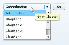
When form elements do not have on-screen text that tells the user the purpose of the form element, or if that prompting information is coming from more than one place, use a toolTip attribute to label the form element. This not only provides a tooltip, but also sets an accessible name for the form control. This name is then used as the label for the form field in screen readers. (You can also set the accessible name directly, see ‘Alternative Solution’ below.)
Tooltips can be provided through Action Script, or can simply be written into the MXML:
<mx:ComboBox x=“240” y=“107” toolTip=“Go to Chapter” dataProvider=“{myPages}” width=“160”></mx:ComboBox>Alternative Solution for any Type of Form Field: set an Accessible Name
If the solutions above are not well-suited for your particular case, setting the accessible name through Action Script is another option:
<mx:TextInput x=“10” y=“499”
creationComplete=“event.target.accessibilityProperties=new AccessibilityProperties();
event.target.accessibilityProperties.name=‘Your Name’” />
If an accessible name has not be set and a toolTip has been set, the toolTip will be used as the accessible name.
Testing HTML
| Testing technique | Description |
|---|---|
| Tools | Use the Form Labels Favelet to view the markup of all form controls on the page. Other tools like the Web Accessibility Toolbar and Chris Pederick’s Web Developer toolbar also provide ways to view the form markup. |
| Output | The JavaScript alert will indicate the number of definite errors and the number of form controls that need visual review. When you dismiss the alert, form fields that definitely do not have labels are marked with ‘Error.’ In addition, label, title, fieldset and legend markup (markup used to label form fields) will be revealed on the page.
|
| Analysis | If the on-screen prompting text is contiguous (so that entire label can be inside one HTML tag) and if it adequately indicates the purpose of the control, then the If that on-screen text is not adequate or if it is dispersed (coming from more than one place), then the There may be a situation where dispersed labeling information will not cause the form to need a Note that labeling information is dispersed in both of these cases so the |
Testing Mobile Applications
| Testing technique | Description |
|---|---|
| Tools | Use the screen reader on the device (VoiceOver on iOS and TalkBack on Android) while interacting with the form using swipe gestures or keyboard. |
| Output | When focus is placed on the form control, the screen reader reads the text label of the field along with the type of control. |
| Analysis | The easiest way to check this is to use a Bluetooth keyboard and tab between the form controls on the page. Listen for the label and ensure that the text label includes the label, required indicator (if present on the screen) and any instructions that are associated with the control. If there is placeholder text in the field, that text will also be read. The placeholder text is not sufficient to label the field as this text disappears when a value is entered. To check whether you are hearing the placeholder text or the label, enter data into the field and move out of and back into the form field. If label was not defined, then you will only hear the data that was just entered into the field and the label will no longer be read. |
Testing PDF in Acrobat
| Testing technique | Description |
|---|---|
| Tools | Check the field labels by hovering over them. You can also check them, and change them, by editing the control. In Acrobat 9, select Forms > Add or Edit Fields, then right click on a control in the fields pane and select properties. The process is similar in Acrobat 10, but select Tools > Forms > Edit to start. It is always a good idea to check the reading in JAWS, as well. Verify in JAWS that the form fields are announced with the correct labels and in the correct order. |
| Output | Verify that the correct label is used and, when radio buttons are used, that they are grouped properly so that each button has the correct label. The order should match the visual order on the page, and you can easily check this in the forms edit mode. Controls are shown by page and you can expand each radio button group to see the individual items, and drag them to change the order. Also check navigation in JAWS. You should be able to tab between groups of radio buttons and use the arrow keys to move between the radio buttons within a group. |
| Analysis | Make note of any fields that are missing label text or have incorrect text. |
Related Guidelines
508 Web § 1194.22 (n)
When electronic forms are designed to be completed on-line, the form shall allow people using assistive technology to access the information, field elements, and functionality required for completion and submission of the form, including all directions and cues.
WCAG 2.0 Level A - 1.1.1 Non-text Content
All non-text content that is presented to the user has a text alternative that serves the equivalent purpose, except for the situations listed below.
- Controls, Input: If non-text content is a control or accepts user input, then it has a name that describes its purpose. (Refer to Guideline 4.1 for additional requirements for controls and content that accepts user input.)
- Time-Based Media: If non-text content is time-based media, then text alternatives at least provide descriptive identification of the non-text content. (Refer to Guideline 1.2 for additional requirements for media.)
- Test: If non-text content is a test or exercise that would be invalid if presented in text, then text alternatives at least provide descriptive identification of the non-text content.
- Sensory: If non-text content is primarily intended to create a specific sensory experience, then text alternatives at least provide descriptive identification of the non-text content.
- CAPTCHA: If the purpose non-text content is to confirm that content is being accessed by a person rather than a computer, then text alternatives that identify and describe the purpose of the non-text content are provided, and alternative forms of CAPTCHA using output modes for different types of sensory perception are provided to accommodate different disabilities.
- Decoration, Formatting, Invisible: If non-text content is pure decoration, is used only for visual formatting, or is not presented to users, then it is implemented in a way that it can be ignored by assistive technology.
WCAG 2.0 Level A – SC 1.3.1 Info and Relationships:
Information, structure, and relationships conveyed through presentation can be programmatically determined or are available in text. (Level A)
WCAG 2.0 Level A – SC 3.3.2 Labels or Instructions:
Labels or instructions are provided when content requires user input. (Level A)
