26. Contrast for Text Readability
Make sure text has good foreground/background contrast
Using a contrast ratio tool, choose text color and text background color so that the contrast ratio between the colors is at least:
- 4.5:1 for small text
- 3:1 for text that is at least 18 points or bold 14 points
- 7:1 when one of the colors is red (or nearly red) and other color is black (or nearly black)
- This guideline applies to both encoded text and images of text.
- This guideline does NOT apply to:
- Logos
- Images that are for decoration only
- Greyed-out or inactive User Interface controls
- Images no one is meant to read (e.g. book-cover icon)
Rationale
The contrast ratios for small and large text are from W3C’s Web Content Accessibility Guidelines 2.0. They are based on research designed to create a measurable definition of sufficient contrast. The 508 Refresh will likely use the same measurements.
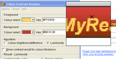
There are a number of free tools that use the WCAG 2.0 algorithm to test contrast. For example, the Paciello Group’s Contrast Analyser is used in the examples presented in the General Techniques for this PG.
Meeting these contrast ratios avoids cases where text is difficult to read due to insufficient contrast. This is important for users with common minor visual acuity issues.
The contrast tests are also important for users with color blindness. The WCAG 2.0 algorithm calculates brightness without consideration of color. For example, red and green of exactly the same brightness, would have a 1:1 ratio, which is the same ratio a color would have with itself. So, for the most part, when you test for contrast, you are also testing to ensure that people with color blindness can read the text.
Because of the biology of color blindness, however, red often appears darker to people with color blindness than it does to people without color blindness. This is the reason for the increased level of contrast when comparing red (or nearly red) and black (or nearly black).
Added Benefits:
- The 3:1 ratio is the International Standards Organization (ISO) and American National Standard Institute (ANSI) requirement for minimum contrast for users with standard vision using a computer monitor. As such, following Pearson Guideline 26 ensures that we meet this basic need for all users.
- Pearson Guideline 26 requires an enhanced contrast ratio for small text and this helps users who may be viewing the content in less-than-ideal lighting conditions (e.g. mobile device screen in sunlight).
Techniques
- Use a Contrast Analyzer that supports the WCAG 2.0 Contrast Ratio Algorithm while selecting foreground and background colors for text. A number of these tools are available. Contrast Analyser from the Paciello Group is available for free and is used for the examples in these guidelines: http://www.paciellogroup.com/resources/contrast-analyser.html (Mac & Windows)
- Avoid placing text over complex backgrounds. One way to avoid this is to provide an outline or shading around the letters. This way, the outline or the shading becomes the background.
If you have text over an image, pattern or gradient, make sure the contrast is sufficient between the text and the area of the background that provides the least contrast with the text color. For example, the yellow text in the image below sits over a few shades of red. Since the least contrast exists between the yellow text and the lighter shade of red, you would use the lighter shade when testing the contrast:

When selecting the text color for anti-aliased text, choose a center-most pixel that reflects the perceived color of the text:

- If the text does not have enough contrast with the background, the pull-down menu next to the color in Contrast Analyser will provide some suggested similar colors. For a finer level of control, go to Options > Show color sliders, where you can adjust the colors bit by bit until you find a combination that meets that requirements.
Most often the technique just mentioned will yield a color combination very similar to your original design. Occasionally, though, as with white text on a yellow background, there is no color combination that has a similar appearance. In this case, you can provide shading just under the text to achieve the necessary contrast, while maintaining the intended color scheme:
Before:

After:

Technology Specifics
HTML | XHTML | CSS | JavaScript
- A common browser feature allows users to set their preferred colors for any colors that were not set by the browser. If you set only the foreground color or only the background color, the color might be paired with a color that provides little or no contrast. So, set both foreground or background color, or set neither. (Don’t forget links and visited links.)
When the default design does not have enough contrast and when modifying the default design is problematic, you can meet the requirement by creating an alternate style sheet.
- 7:1 Contrast: The new Section 508 guidelines may (once finalized) require 7:1 contrast where optional views are provided. So, provide at least one style sheet where the contrast is at least 7:1 for all text.
- Example code for adding alternate style sheets:
<!– settings from this file are common to all views:
link does not have a title and rel is “stylesheet” –>
<link rel=“stylesheet” type=“text/css” href=“persistent.css” />
<!– default view: link has a title and rel is “stylesheet” –>
<link rel=“stylesheet” type=“text/css” href=“base.css” title=“Default Colors” />
<!– optional view: link has a title and rel is “alternate stylesheet”–>
<link rel=“alternate stylesheet” type=“text/css” href=“high_contrast.css” title=“High Contrast” />
The values of the title attributes will appear in menus provided by standards-compliant browsers:image
UI Controls for Choosing the Alternate Style Sheet: Provide a UI control and script that allows the user to select a style sheet. The control itself must meet contrast requirements. The following article describes how this is done and provides a script that accomplishes this without interfering with browser-based style sheet menus: www.alistapart.com/stories/alternate/
As described, use a cookie, so that the user’s choice of style sheet persists from page to page. (Browser menus alone generally do not remember the user’s choice from page to page.)
- Images of text: A site may have images of text that are not placed through the style sheets. If such images don’t meet the contrast requirements, an alternate style sheet alone will not fully satisfy this PG. The images of text still would not have enough contrast. In this case, use JavaScript to replace the images with high contrast images or with text. A single control should then be provided to trigger the JavaScript that swaps the style sheet as well as the JavaScript that swaps the images.
Testing HTML
| Testing technique | Description |
|---|---|
| Tools |
For both foreground (text) colors and background colors move the visual cursor (eye dropper icon) to choose a favorable pixel. To help judge whether text is 14 point bold / 18 point or larger, you can use the Large Text Favelet. |
| Output | After selecting the foreground and background colors, the Colour Contrast Analyser will display the Luminosity Contrast Ratio for that combination. (Have “Algorithm, Luminosity” checked and have “Show Contrast for Colour Blindness” not checked.) The large text favelet places example 14 point bold and 18 point text on the screen to allow visual comparison. Horizontal lines show the official measure of 14 points and 18 points; though, as you’ll see by the example text, fonts don’t typically fill their full point height. |
| Analysis | Report all instances where contrast ratios miss the guidelines as errors - 4.5:1 for normal text and 3:1 for larger text (18 point or 14 point bold or bigger). When the ratios are close to the requirement, you can suggest combinations that meet the guidelines by changing colors with the colour select combo boxes in the Contrast Analyser application. |
Testing Mobile Applications
| Testing technique | Description |
|---|---|
| Tools |
The Colour Contrast Analyser is a stand-alone contrast testing application. You can also pull it up from the Web Accessibility Toolbar: Colour > Contrast Analyser [application]. For both foreground (text) colors and background colors move the visual cursor (eye dropper icon) to choose a favorable pixel. |
| Output | After selecting the foreground and background colors, the Colour Contrast Analyser will display the Luminosity Contrast Ratio for that combination. (Have “Algorithm, Luminosity” checked and have “Show Contrast for Colour Blindness” not checked.) The large text favelet places example 14 point bold and 18 point text on the screen to allow visual comparison. Horizontal lines show the official measure of 14 points and 18 points; though, as you’ll see by the example text, fonts don’t typically fill their full point height. |
| Analysis | Report all instances where contrast ratios miss the guidelines as errors - 4.5:1 for normal text and 3:1 for larger text (18 point or 14 point bold or bigger). When the ratios are close to the requirement, you can suggest combinations that meet the guidelines by changing colors with the colour select combo boxes in the Contrast Analyser application. |
Related Guidelines
WCAG 2.0 AA - 1.4.3 Contrast (Minimum)
The visual presentation of text and images of text has a contrast ratio of at least 4.5:1, except for the following: (Level AA)
- Large Text: Large-scale text and images of large-scale text have a contrast ratio of at least 3:1;
- Incidental: Text or images of text that are part of an inactive user interface component, that are pure decoration, that are not visible to anyone, or that are part of a picture that contains significant other visual content, have no contrast requirement.
- Logotypes: Text that is part of a logo or brand name has no minimum contrast requirement.
