27. Don't Rely on Color Coding
Don’t Rely on Color Coding
When color is used to provide information, also provide the information through another visual method.
Rationale
People with color blindness can have difficulty distinguishing between colors, particularly red/green, red/black and green/blue. In addition people with visual impairment often experience difficulty with color perception. So, if color is used to provide information, the information should also be provided in another way for these visual users.
Also, even a user who has no color vision issues might turn off style sheets, use their own style sheet, or select custom colors. If you’ve provided information by color coding text, for example, the information may be lost with these customizations.
PGs 27 – 29 discuss ways to make visual content available to those who cannot see it. Many of these techniques involve providing content that is hidden to most users, and revealed only through assistive technologies, like screen readers.
When providing alternate content for color though, the content must be available to users without assistive technology. For example, if a red check mark and a green check mark are used to indicate correct and incorrect answers, hidden alt-text for the check mark images is not sufficient for Pearson Guideline 27. Using a red x and a green check mark would satisfy Pearson Guideline 27, as the variation in shape is a supplemental visual indicator. (And, as described in Pearson Guideline 29, with alt-text for the images, the information is also available to screen readers.)
Techniques
Text Labels
When you use color coding, the simplest solution is to provide text labels in addition to color. For example, in the screen capture below, the quiz results are expressed visually by rectangles, which are labeled with both color coding and text labels.

The words correct and incorrect label each rectangle so that users who are color blind can still understand the graphics. The image below shows the same screen capture as it would be seen by a user with the most common form of color blindness, Deuteranopia:

Lead Lines
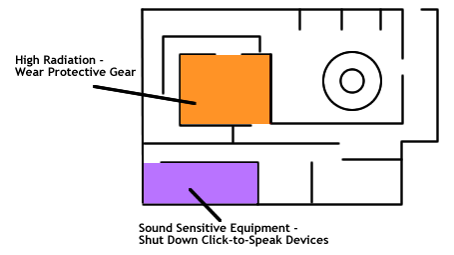
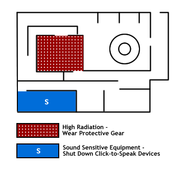
For maps and diagrams, lead lines to associate labels with sections of the image can be helpful.

Patterns and Symbols
Another method is to supplement color with other visual elements such as patterned fills, varying line styles or even symbols added to shaded areas.

To keep use of patterns from creating overly busy graphs you can:
- Label a section with one letter or just one shape instead of a pattern
- Instead of using equally busy patterns for each section of a graph, start solid and add pattern elements, so that the patterns get busier or less busy with the trend, or along an axis. For example, if one section of a chart is filled with 20 tiny diamonds, the next may have only 10 tiny diamonds spaced further apart, the next may have only 5 tiny diamonds spread even further apart, and the last may have no pattern at all.
- Highlight just one section of a graph with pattern
- Change the size of pattern elements. For example, if one section of a chart is filled with 20 tiny diamonds, use 7 larger diamonds for the next section, and 3 even larger diamonds for the next.
Tip: But Please Keep the Colors!
Do not remove color to meet accessibility requirements, as color is helpful to many users, including those with cognitive impairments. In general, accessibility requirements are best met by enriching content with multiple means of rendering information, rather than by removing features.
Testing
| Testing technique | Description |
|---|---|
| Review | Skim the page looking for any color coding. |
| Analysis | For any cases of color coding, see if there is another visual way to get the same information. If not, this is an error. Remember that many users who can’t see certain color coding will not have a screen reader, so text alternative does not correct such issues. |
Related Guidelines
508 Web § 1194.22 ©
Web pages shall be designed so that all information conveyed with color is also available without color, for example from context or markup.
WCAG 2.0 Level A - SC 1.4.1 Use of Color:
Color is not used as the only visual means of conveying information, indicating an action, prompting a response, or distinguishing a visual element. (Level A)
