6. Keyboard Access
Check keyboard access (access without a pointing device) and correct any issues
Ensure that keyboard keys (instead of a mouse and instead of touch screen gestures that require eye-hand coordination) can be used to:
- Reach and operate all controls
- AND Navigate through active elements, following the reading order
- This guideline does not mean that an on-screen keyboard must always be visible on mobile devices. Test on mobile devices using a physical keyboard and using the gestures that are part of the screen reader functionality.
- Keyboard access is primarily the responsibility of the user agent (e.g. Web browser, PDF reader, Flash player). To address this guideline, we ensure that our content supports the user agent’s solution.
Rationale
By ensuring that our content supports keyboard access, we provide access to a number of user groups who do not use a mouse.
Additional Benefit: Many mobile device users also rely on keyboard access.
General Techniques
The Basics
- Make sure that keyboard-only users can get to each active element (e.g. link, form field, control). This is usually accomplished using tab keys and arrow keys.
- Just getting to links and controls is not enough, make sure keyboard-only users can also activate each active element (e.g. link, form field, control). This is usually accomplished using enter key or space bar.
- Finally, make sure that keyboard-only users can escape each element to return to other items on the page.
Be Mindful that Learning New Key Presses can be Burdensome
Wherever possible, use the keyboard access methods and keys that are the default in the particular technology you are using, rather than inventing new access methods that users will need to learn.
Hidden Content
Make sure that hidden active elements (e.g. links, form fields, controls) are not part of the tab order. It can be be very frustrating and disorienting to have to press tab again and again to step through hidden content. Users may assume that there’s no keyboard access at all.
Do Not Require Physically Skilled Key Pressing
Do not require users to hold down keys for a certain amount of time or to accomplish any other specific timing of key presses.
MouseOver Effects
Provide equivalents for keyboard access users when MouseOver effects:
- provide information or reveal new user interface elements
- provide a different (e.g. clearer, simplified, larger) view of information
- provide functionality
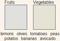
Category Drag & Drop
When users need to put items into categories, one approach is to have a menu of categories pop up when the user tabs to one of the items and hits enter.
The Up and Down Arrow Keys allow the user to select between categories in the menu. Hitting Space Bar selects the category and so drops the item into that category. Tab and Shift Tab can move the user to the next item or previous item.
(the modern keystrokes are: spacebar to select an item; enter and/or ctrl+m to drop an item. Tab or arrows to move around between focusable draggables or destinations).
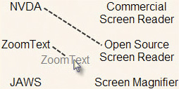
Matching Drag & Drop
When users need to match elements of one list with elements of another list, users will need a way to select an item, jump easily to the other list, and then select the matching item. Users should be able to begin from either list. Simple keystrokes can be used to allow this. Tab and Shift Tab can be used to jump back and forth between the lists. Up and Down Arrow Keys can be used to move within the list. Enter can be used to select items to drag (or begin matching line). And Space can be used to select locations to drop (or complete matching line). This way, if a user choses an item, but then decides not to match that item yet, they can select another item using Enter.
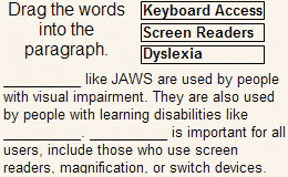
Fill-in-the-Blanks Drag & Drop
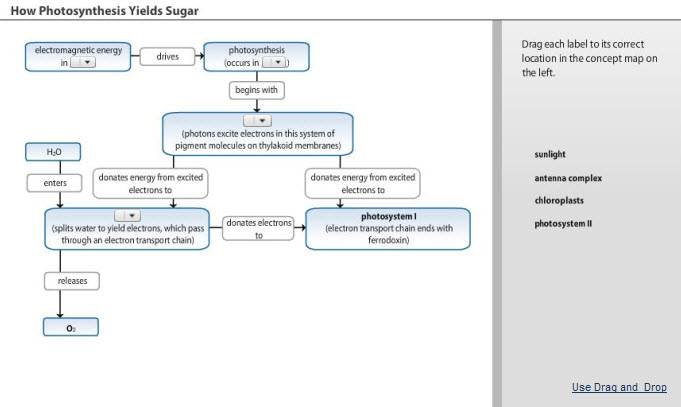
When an exercise allows a user to choose from a list of words and drag those words into blanks in a paragraph, a key part of working through the answers is being able to glance back at the list of words while reading the paragraph. To provide a parallel experience for screen reader users, one strategy is to provide a special view where the blanks are replaced with pull down menus. This will also be useful for people who do not use a mouse because of mobility or dexterity issues.
Details
Add a link, such as “Use Activity without a Mouse” to the user interface. Make sure link is just after the drag-and-drop instructions in the reading order, so that screen reader users can find it quickly.
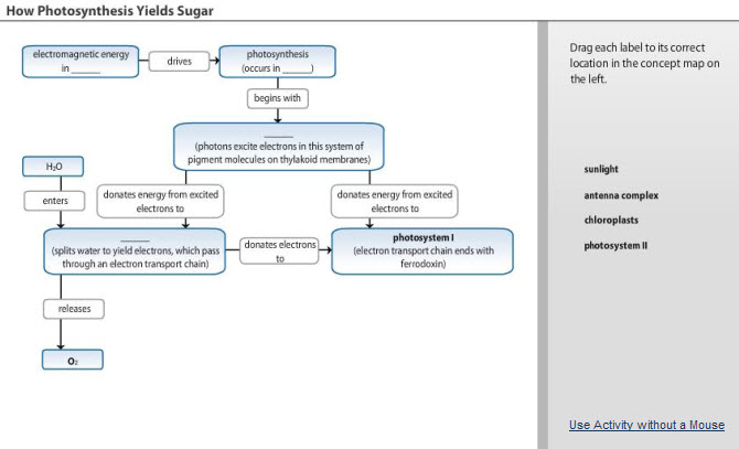
When the "Use Activity without a Mouse" link is clicked, replace the blanks with pull down menus and replace the link with a link such as "Use Drag and Drop".
HTML
In-Page Links
When coding in-page anchor links, code the target of the in-page link using an a element with tabindex=“-1”. This ensures that you will avoid two bugs in Internet Explorer (versions 5-8) that break keyboard access. Without tabindex=“-1” many inpage links will appear to work visually when first activated, but when the user tries to move forward using the tab key, the user is brought back to the skip link instead of moving forward on the page.
Image Maps
When creating image maps, use usemap, <map> and <area>. Do not use ismap or the x and y coordinates provided by input type=“image” to create image maps. Browsers allow keyboard access users to tab to area elements, but do not support selecting a location using the keyboard in image maps created using ismap or input type=“image”.
Note: Image maps that use area elements are often called client-side image maps, while the others are often called server-side image maps. Despite the terminology, only maps created using area elements offer keyboard access, regardless of whether you add server-side or client-side scripting to ismap or input type=“image”.
Considerations if you are changing the tab order
Allow the tab order to follow the reading order. (This occurs automatically, unless you change the tab order.) Tab orders that have been set based on tabindex are difficult to maintain. They can cause a mismatch between the tab order and the reading order. This can be disorienting for screen reader users. Unless screen reader usability testing with skilled screen reader users is planned, do not reset the tab order using tabindex.
Keyboard Shortcuts
Common browsers allow accesskey attributes to override keyboard access to browser menus. Accesskey attributes can also override the keystroke commands that allow keyboard access with a screen reader. Do not use accesskey unless:
You use only numeric
accesskeyvalues (0-9)~OR~
- The access keys are not active by default. Instead, the user can switch them on after reviewing the list of keys in user preferences.
New Browser Windows
If you are opening a new browser window, it is not necessary to provide keyboard shortcuts to close or minimize the window. Instead, you should rely on the operating system’s keyboard commands for adjusting windows.
Here are the commands used for Windows and Mac:
| Operating System | Minimize | Close | Menu of Options |
|---|---|---|---|
| Windows | Alt Space, then n | Alt F4 | Alt Space |
| Mac | Command m | Command w |
JavaScript
Be Careful using blur() (“Stop the Ants”)
Do not trigger blur() for an element in response to an onFocus event for that element. This prevents keyboard access for the element. This mistake is often made when developers wish to remove the outline that appears around a link when the link is clicked. Instead, use the following CSS code to remove that outline in modern browsers (e.g. Firefox 3+, Internet Explorer 8+).
a:active {
outline-width: 0;
}
The CSS above uses a:active. Do NOT use a:focus or even just a in the code above, as this would hide the focus indicator - See Pearson Guideline 7.
Select Menus and OnChange
Avoid using select menus with onchange handlers where the handler changes focus or causes an irreversible event like sending a message or submitting a form. In such cases just rely on a “Go” button instead of an onchange handler.
Here are the problems with select menus and onchange handlers:
In Internet Explorer, if you use arrow keys to move up or down in a select menu with an onchange handler, the onchange event triggers with each move. If that handler changes focus you will be moved away from the select menu with one up or down arrow; if it results in some irreversible action, then, just by an innocuous move in a menu, you have caused that action. On the other hand, if you first use alt+down-arrow to open the select menu and then use arrow keys in the open list, no onchange event fires until you press enter or tab out of the menu. This situation is aggravated by the fact that the most popular screen reader says, “Combo box, to change the selection use the arrow keys.” This particular problem is specific to Internet Explorer.
For other browsers (Chrome, Firefox, and Safari) and for Internet Explorer when alt+down-arrow is used to open the menu, the onchange event does not trigger until you press enter or tab out of the control. So for all of the browsers, when you tab out of the open select menu, the corresponding on-change action, possibly irreversible, is taken and you might have thought that you were just leaving the control. Again, use the “Go” button in such cases.
Custom Controls
Make sure that custom controls are keyboard accessible using one of these techniques:
(BEST) Start with HTML/XHTML elements that are interactive by default (e.g. a,
button,input). For example, you may wish to have a box that acts as a control that changes the page. Instead of making adivelement interactive, you might use abuttonelement. This way, you take advantage of well-tested standard keyboard access that comes with elements that are interactive by default. You can use CSS to adjust thebuttonelement to appear as you wish:button.myactivebox { width: 3em; height: 3em; float: left; / remove browser-provided 3d edge effect */ border: 0; /* remove color assigned by browser */ background: transparent; /* add basic link-style cursor for mouse users*/ cursor: pointer; }* The following elements require additional consideration and so may not be the best choice as a base for your custom control:
input type=“submit”orinput type=“image”. For these elements, the onClick event can be triggered if a user presses enter anywhere within the form, or anywhere within the page if there are no<form>tags. (This won’t happen, though, if the focus is on a natively active element, like a link, when the user presses Enter, which is why these elements are appropriate for use with typical forms.) Also, in some browsers, these elements automatically cause a page refresh. See Pearson Guideline 10for tips on avoiding changing the user’s place on a page unexpectedly.- Or, you might use scripting to make an element that is not normally interactive into an interactive element. This requires considerable careful consideration for keyboard access. First, give the element a
tabindex=“0”attribute. This way, the element will be included in the natural tab order. And, be sure to follow the coding tips below. Unlike natively active elements, these items won’t be keyboard accessible if you only use onClick and they may cause problems if there are submit buttons nearby:- While browsers allow the keyboard to trigger
onclickevents for active elements, they typically do not allow the keyboard to triggeronclickevents for elements that are not normally active. So, add anonkeypressevent if needed. Be sure to code theonkeypressevent so that it only triggers an action if the appropriate key is pressed (usually the enter key). See “When usingOnkeypress,Onkeydown, orOnkeyup” below for more detail on the key-related events. - Screen readers will not automatically know the purpose of the element. So, include text that is available to screen readers that indicates the purpose of the element and how to interact with it. (Pearson Guideline 20 explains further.) This is a case where testing the user experience with a screen reader is essential.
- Be sure this type of artificially active element never appears within a form that has a submit button (e.g.
input type=“image”,input type=“submit”). When a user presses enter within a form, elements designed to submit the form will be triggered, including anyonClickhandlers on those elements. If there are no form tags, this will happen if enter is pressed anywhere on the page. The one exception is if a natively actively element (e.g. link, button) has focus at the time. This allows keyboard access users to use links and buttons within a form, but this exception does not apply if an active element was created using an element that is not normally active (e.g.div,span) . So, a keyboard access user will not be able to “click” on such custom elements, without triggering the form submit. - In Firefox,
<a>elements (withouthrefattributes) that have been made active through scripting do not automatically gain focus indicators. See Pearson Guideline 7for more on focus indicators and how to add them when needed.
- While browsers allow the keyboard to trigger
Selecting Particular Points
The HTML techniques for this PG explain that image maps can be keyboard accessible if you use area elements instead of using the x and y coordinates provided by input type=“image” or ismap. For more complex JavaScript (or server-side) functionality where you would need 30, 40 or more area elements, though, area elements may not be appropriate as keyboard access users would have to tab through all of those area elements.
In such cases, if you use the x and y coordinates provided by input type=“image” or ismap, provide equivalent functionality for keyboard access users through buttons and controls. For example, if users need to plot points on a graph, you might provide text entry fields where the x and y coordinates of each point can be entered.
Another option is using layers of elements if you detect that the user is using keyboard access. For example, at first the graph might be made up of four input type=“image” elements. If any are clicked using the mouse, the x and y coordinates might be used. But if one is selected using the keyboard, it might be replaced by a set of 4 smaller area elements, and so on, until the keyboard user is able to select the particular point needed.
Clearing Default Text in a Form Field
Do not clear user-entered text in form fields when focus is placed on the field. Screen reader users, in particular, may move backwards through the fields to check their entries just before submitting the form. If you write a script designed to clear the placeholder text, be sure to check the value of the text, and only clear the text if it really is just the placeholder text.
Another option is to use the HTML 5 placeholder attribute. If you support browsers where this is not implemented, you might use JavaScript for those browsers only. This article shows how to use JavaScript for browsers that don’t support placeholder while still using clean HTML 5 tagging: Open Web Designer Wall Article in a New Window.
When using Onkeypress, Onkeydown, or Onkeyup
Onkeypress, onkeydown or onkeyup are triggered in some browsers by any key press at all, including key presses commonly used for keyboard access and screen reader navigation. For example, in some browsers, if a link opens a new window on key press, keyboard access users won’t be able to tab past the link because focus will always move to the new window. When using natively active elements, onclick is sufficient for both mouse access and keyboard access as the Enter key fires the onclick event for keyboard access users. So, it is usually best to avoid using onkeypress, onkeydown or onkeyup. If you do use these, be sure:
- The functionality is purely decorative (inconsequential) and doesn’t change focus.
- Or, you use JavaScript to ensure that actions only occur when particular keys are pressed and either:
- You are only taking over the keys commonly used for ordinary components (arrow keys and enter) only when focus in on a custom control and the user can tab off of the custom control. (Note: to do this across browsers you need to use
onkeydowninstead ofonkeypress.) - You are taking over keys no matter where the user is on the page, but the functionality is not active by default. Instead, it is made active through user preferences. The users should be able to read which keys would be over-ridden. This way, they can avoid activating the functionality if the keys would interfere with their access method.
- You are only taking over the keys commonly used for ordinary components (arrow keys and enter) only when focus in on a custom control and the user can tab off of the custom control. (Note: to do this across browsers you need to use
Android Applications
Android applications can be used with touch using navigation gestures and with a Bluetooth keyboard. It is recommended that interactive elements have a touch target of 48dp which is a physical size of about 9mm (for more information see Metrics and Grids).
The application works with touch and a Bluetooth keyboard when its android:focusableattribute to set to true. Android provides ways to control which controls are focusable using setFocusable() and isFocusable() and allows focus to be set to control using requestFocus().
The order in which controls receive focus is determined by the focus order which is based on an algorithm that finds the nearest neighbor in a given direction. This can be changed using android:nextFocusDown, android:nextFocusLeft, android:nextFocusRight,and android:nextFocusUp. At runtime, the focus order can be changed using methods such as setNextFocusDownId() and setNextFocusRightId().
Touch events should only be triggered when touch is removed from the control and the ACTION:DOWN trigger should be avoided.
For more information:
- Open Google’s Enabling Focus Navigation in a new window.
- same link as above— neither go to specific areas and those areas seem teh g0nezOpen Google’s Building Accessible Custom Views > Handling directional controller clicks in a new window.
iOS Applications
iOS applications allow users to use touch to navigate the screens and provides limited access through a Bluetooth keyboard unless VoiceOver is used in conjunction with the Bluetooth keyboard. For touch and gesture navigation, provide a minimum 44 X 44 point hit target area and avoid crowding the items too closely together. This will allow users to easily access a specific UI element.
Standard interface elements are automatically touch accessible with and without the VoiceOver screen reader. Touch events should only be triggered when touch is removed from the control and the touchesBegan:withEvent should be avoided. Custom container and individual views must be made accessible in order for users to be able to interact with the interface elements.
How to make custom views accessible
There are two ways to make a custom individual view accessible:
- Set the custom view’s accessibility status in the code that instantiates it
- Implement the
isAccessibleElementmethod of theUIAccessibilityprotocol in the custom subclass
For custom container views, each interface element needs to be made accessible individually. The container view should not be made accessible since users interact with the interface elements and not with the container itself. To make container view interface elements accessible, implement the UIAccessibilityContainer protocol.
PDF in Acrobat
Keyboard access in PDF is generally fine in Acrobat. Ensure that the tab order for active elements including links and form fields is correct.
Tab Order
The tab order in a PDF is determined by the page properties and the order of the tags in the tags tree.
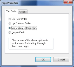
The location of the pages panel will vary depending on your version of Acrobat. In Acrobat 9 Pro, for example, you can find the panel at View > Navigation Panels > Pages. Select all the pages in the document. Select Page Properties in the navigation panel options menu and choose a tab order option. For tagged documents, always use “Use Document Structure” option.
PowerPoint
Keyboard access is controlled by PowerPoint. No special consideration is required within the content to make it accessible by keyboard. Verify that the reading order is correct so that users can navigate the content in the correct order.
In PowerPoint, navigate with these keyboard shortcuts:
- Start slideshow - F5
- Next animation / slide - enter, page down, right or down arrow, spacebar
- Previous animation / slide - page up, up or left arrow
- Previous slide - P
- Go to slide in slideshow - type page number + enter
When testing with JAWS, use these keyboard shortcuts to speak content:
- Next word - Insert + right arrow
- Next line - down arrow
- Next sentence - alt + down arrow
- Whole page - insert + down arrow
- Next list item - i
- Speak slower / faster - alt + ctrl + page down or page up
Flash & Flex
In Flex, sometimes you’ll find that the tab order does not match the reading order. To correct this, arrange the items in the source code so that they appear in the source code in the same order as your reading order.
Testing
| Testing technique | Description |
|---|---|
| Tools | The main tool is the keyboard. Use the keyboard to be sure you can get everywhere and do everything on the page using the keyboard. There are additional tools that may help, Web Accessibility Toolbar – Structure – Tab Order indicates the tab order of each active object. Web Accessibility Toolbar – Structure – TabIndex will indicate if any objects have been assigned As you are checking keyboard access be sure to check for focus visibility at the same time (Pearson Guideline 7). |
| Output | This is a time-consuming test, but it is not unusual for an object to appear to be a link or button and just be a div with an on-click handler. It is essential to be sure that all functionality is available (and visible) from the keyboard. |
| Analysis | Make note of functionality that is not available from the keyboard and of instances where keyboard focus is not visible (Pearson Guideline 7). |
Testing Mobile Applications
| Testing technique | Description |
|---|---|
| Tools | User will interact using gestures, touch, and through an external Bluetooth keyboard. Ensure that users can reach all elements on the screen with Bluetooth keyboard and gestures. The keyboard works differently on Android and iOS:
As you are checking keyboard access be sure to check for focus visibility at the same time (Pearson Guideline 7). |
| Output | Ensure that all page elements can be used with gestures and a Bluetooth keyboard. Note: on iOS test with VoiceOver turned on. |
| Analysis | Make note of functionality that is not available from using gestures and Bluetooth keyboard. Note instances where keyboard focus is not visible (Pearson Guideline 7). |
Gesture Commands
| Action | iOS Gesture | Android Gesture |
|---|---|---|
| Select and speak an item as it is touched | Drag over the screen | Drag over the screen |
| Speak the selected item | Tap | Tap |
| Stop speaking | Two-finger tap | Global Context Menu: Down then right then select Pause Feedback |
| Activate the selected item | Double tap | Double tap |
| Read all accessible items from the top of the screen | Two-finger flick up | Up then down or Open Global Context Menu (Down then right) then select Read from Top |
| Read all accessible items from the current position | Two-finger flick down | |
| Move the cursor to the next or previous item and hear a spoken description | Flick right or left with one finger | Flick right or left with one finger |
| Navigation options | Rotor: Rotate two fingers as if turning a dial | Global Context Menu: Down then right |
Bluetooth Keyboard Navigation with VoiceOver
| Key Command | Action |
|---|---|
| Control – Option – H | Home button |
| Control – Option – Shift – S | Turn screen curtain on/off |
| ESC | Back button |
| Tab | Move between form fields |
| Enter | Activate form |
iOS Bluetooth Keyboard Quick Nav Mode
To turn on quick nav mode, press both the right and left arrow together.
| Key Command | Action |
|---|---|
| Right Arrow | Select the next item |
| Left Arrow | Select previous arrow |
| Up Arrow – Down Arrow | Tap the highlighted item |
| Control – Up Arrow | Select the first item |
| Control – Down Arrow | Select the last item |
| Option – Arrow Key | Scroll in the direction pressed |
| Up Arrow – Left Arrow | Move the rotor to the left |
| Up Arrow – Right Arrow | Move the rotor to the right |
| Shift – Arrow Key | Move the cursor in the direction pressed |
| H | Move to next heading |
| L | Move to next link |
| R | Move to next text field |
| B | Move to next button |
| C | Move to next form control |
| I | Move to next image |
| S | Move to next static text |
| X | Move to the next list |
| M | Move to the next element of the same type |
| 1 - 6 | Move to the next heading level that corresponds to the number pressed |
Testing PDF in Acrobat
| Testing technique | Description |
|---|---|
| Tools | There are two main tools to use when testing keyboard access: the keyboard and the Pages pane. Select all pages in the Pages pane and verify that the tab order on page properties is set to “Use Document Structure.” Next, tab through the document to ensure that it tabs to links and form fields, and does so in the proper order. In forms, tab should move between questions and for groups of radio buttons, the cursor keys should move between the question’s choices. |
| Output | The cursor should be placed properly in the form fields and the focus indicator should appear over the links as you tab to them. |
| Analysis | Make note of instances in which form fields and links are not accessible by tabbing, or when the tabbing order is incorrect. |
Related Guidelines
508 Software § 1194.21 (a)
When software is designed to run on a system that has a keyboard, product functions shall be executable from a keyboard where the function itself or the result of performing a function can be discerned textually.
508 Web § 1194.22 (e)
Redundant text links shall be provided for each active region of a server-side image map.
508 Web § 1194.22 (f)
Client-side image maps shall be provided instead of server-side image maps except where the regions cannot be defined with an available geometric shape.
WCAG 2.0 A - SC 2.1.1 Keyboard:
2.1.1 Keyboard: All functionality of the content is operable through a keyboard interface without requiring specific timings for individual keystrokes, except where the underlying function requires input that depends on the path of the user’s movement and not just the endpoints. (Level A)
Note 1: This exception relates to the underlying function, not the input technique. For example, if using handwriting to enter text, the input technique (handwriting) requires path-dependent input but the underlying function (text input) does not.
Note 2: This does not forbid and should not discourage providing mouse input or other input methods in addition to keyboard operation.
WCAG 2.0 A – SC 2.1.2 No Keyboard Trap:
If keyboard focus can be moved to a component of the page using a keyboard interface, then focus can be moved away from that component using only a keyboard interface, and, if it requires more than unmodified arrow or tab keys or other standard exit methods, the user is advised of the method for moving focus away. (Level A)
Note: Since any content that does not meet this success criterion can interfere with a user’s ability to use the whole page, all content on the Web page (whether it is used to meet other success criteria or not) must meet this success criterion. See Conformance Requirement 5: Non-Interference.
WCAG 2.0 A – SC 2.4.3 Focus Order:
If a Web page can be navigated sequentially and the navigation sequences affect meaning or operation, focusable components receive focus in an order that preserves meaning and operability. (Level A)
