7. Keyboard Access Visibility
Ensure keyboard access visibility
Ensure that the user’s location on the page will be visually apparent when keyboard keys are used to move from item to item. Note: This is primarily the responsibility of the user agent (e.g. Web browser, PDF reader, Flash player). To address this guideline, we ensure that our content does not interfere with the user agent’s solution.
Rationale
Users with mobility impairment often use keyboard access without screen readers. When using keyboard access, the user is not pointing to a particular location on the page. Instead, they are moving through links and controls without specifying the order in which each item will receive focus. As such, they need to be able to see where focus is on the page.
Most user agents provide a visual effect called a focus indicator that differentiates the item that currently has focus:
HTML links in Firefox 3:

HTML links in Safari 3:

Some form elements have special focus indicators. For example, a text field that is in focus will contain the text cursor as shown in IE 6 below:

However, it is possible to obscure the focus indicator through visual effects or through the layout of the content.
General Techniques
If the focus indicator is not visible, we have two choices in most media types:
- Correct the reason the default focus indicator is not visible
- Add a new focus indicator. Decorative mouse-over effects can often be reused for this.
HTML & JavaScript
- Test to be sure the focus indicator is visible in each supported browser.
- If the focus indicator is partially hidden due to the layout, adjust your CSS to accommodate the focus indicator. For example, if you increase the padding the focus indicator may be hidden by neighboring elements:

This is because the focus indicator surrounds the padding in block elements. So, in this case, you might use the margin property in place of padding. The focus indicator does not surround margins. - If the visual design makes the focus indicator difficult to see on your supported browsers, create your own visual effect for the on-focus state. The link in the image below is a grey box that has focus in Firefox 2. The focus indicator is nearly invisible, a good candidate for a custom visual effect:

If you’ve ever created a mouse-over effect, creating an on-focus effect will seem familiar:OR
- Use the CSS :focus class as you would use the CSS :hover class:
Since a:focus doesn’t work in IE (as of IE 7) you may want to add a:active in addition to a:focus:/* mouse */ a:hover { background-color: #FFFFCC; } /* keyboard */ a:focus { background-color: #FFFFCC; }/* keyboard */ a:focus { background-color: #FFFFCC; } a:active { background-color: #FFFFCC; } - Use the JavaScript event handler
onFocusas you would use the event handleronMouseOver. Also useonBluras you would useonMouseOut.
OR<a href=“filename.html” onmouseover=“JavaScriptCodeOn();” onfocus=“JavaScriptCodeOn();” onmouseout=“JavaScriptCodeOff();” onblur=“JavaScriptCodeOff();”><a href=“filename.html” onmouseover=“JavaScriptCodeOn();” onfocus=“this.onmouseover” onmouseout=“JavaScriptCodeOff();” onblur=“this.onmouseout”>
- Use the CSS :focus class as you would use the CSS :hover class:
- The “outline” for
onfocusis in fact the default focus indicator. So, do not remove the “outline” for the onfocus state using CSS styling.
Android Applications
When a user uses either swipe gestures or a Bluetooth keyboard, a visible indicator on the screen should show the current element that has focus. This is done by default for standard elements. Custom elements should set the style when state_focused=“true”.
Android provides several elegant ways to change the visual appearance based on state:
- Change color: Open Google’s Color State List Resource in a new window.
- Change images: Open Google’s Drawable State List Resource in a new window.
iOS Applications
iOS provides a visible focus indicator for elements that receive keyboard input.
When a user uses swipe gestures with VoiceOver, the element on the page that has VoiceOver focus will have a black rectangle outline. This focus indicator is determined from the property which is a subclass of UIView. Objects should not override the visual focus indicator or set the accessibilityFrame property to nil.
PDF in Acrobat
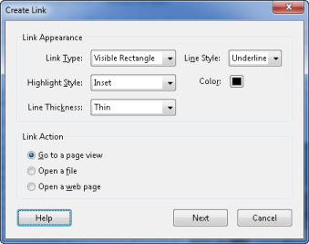
In the link properties, specify the link appearance.

It is important to have the following settings:
- Link Type – Visual Rectangle
- Highlight Style – Inset
- Line Thickness – Thin
- Line Style – Underlined
- Color – Set a color that has 4.5:1 color ratio between the text color and text background color. See Pearson Guideline 26 for more details on color contrast.
Testing
| Testing technique | Description |
|---|---|
| Tools | Test for this while you are testing for keyboard access Pearson Guideline 6. |
| Output | Find and list those objects that lack adequate focus indication. |
| Analysis | Make note of instances where keyboard focus is not visible. |
Testing PDF in Acrobat
| Testing technique | Description |
|---|---|
| Tools | Test for this while you are testing for keyboard access Pearson Guideline 6. For links, use the Select Object tool to highlight each link. In Acrobat 9, this is under Tools > Advanced Editing > Select Object; in Acrobat 10 it is under Tools > Content. Right-click to select properties and verify that the link properties conform to the guideline above, with Link Action set to “Go to a page view” or “Open a web page” as appropriate. |
| Output | As you tab to form fields and links, the cursor and focus indicator should be visible in the form field and you should see the focus indicator on each link. |
| Analysis | Make note of instances in which the focus indicator is not visible. |
Related Guidelines
508 Software § 1194.21 ©
A well-defined on-screen indication of the current focus shall be provided that moves among interactive interface elements as the input focus changes. The focus shall be programmatically exposed so that assistive technology can track focus and focus changes.
WCAG 2.0 AA – SC 2.4.7 Focus Visible:
Any keyboard operable user interface has a mode of operation where the keyboard focus indicator is visible. (Level AA)
