Do, Don't, How-to
TOC: Do, Don’t, How-to
Content
The general rules for content accessibility: keep slides simple and choose a correct layout; use text placeholders, not manual text boxes; follow the instructions for Titles and Footers; have useful link text; set the language used in the slides; and avoid controls like checkboxes.
Use Clear, Simple Language and Layout
- Avoid using overly complex language in slides that provide information or instructions.
- Keep the layout of the slide clear and uncluttered to make it easier to read.
- Avoid watermarks or busy backgrounds to minimize distraction and maintain readability.
- Use white space effectively to separate sections and columns (remember to use built-in features to do this; don't press Tab multiple times).
Select an appropriate layout from the layouts gallery and transfer any existing PPT content into the content placeholders in the accessible template. Use the "Title + Learning Objectives and Content" layout for most slides. Use the "Figure + Caption" layout for figure slides (reposition figure title and caption placeholders as needed to best work with figures). Text content must be placed in content placeholders for the screen reader to read the text.
- Do not copy and paste "manual" textboxes onto slides because screen readers do not always read them. You want real placeholders.
- Math equations and tables should not be converted to images. They should be entered into slides directly (see math and tables for more detail).
- Each slide should have a title and it should not be duplicated. Titles must appear in every slide, concise, unique, and should be included in the title placeholder.
Making the Title
- If you accidentally delete the title placeholder, please create a new slide and do not manually add a text box with the title.
- If a slide's contents needs to be spread across multiple slides, to make slide titles unique, append "(1 of 2)" or similar to the main title text.
- If the slide's title contains math equations within text, replace the symbols with their full names (example: Turn "Consider matrix Δ an identity matrix" to "Consider matrix delta an identity matrix"), but do not insert images-with-alt-text into the title. This is only for title placeholders where adding a MathType object is not possible. See the reading order and math sections for more.
Making the Footer
Use the View → Master → Slide Master layout to insert the Pearson logo. Add the last three copyright years in the banner and Properties dialog box. Insert the copyright dates (be sure to include one space after the © symbol). Insert the Chapter.Section-Slide number (in the right corner).
Use Meaningful Text for Hyperlinks
If you include hyperlinks in your slide, use both meaningful text to show where they link to and the raw URL so that people can copy it manually to paste into a browser. Because raw URLs may be difficult to understand, it is not a bad idea to place them after the main readable content on your slide or in an Appendix slide at the end of your presentation.
Remember that repeatedly using "click here" or "read more" isn't particularly descriptive, and can be misleading if more than one such link appears in your slide.
To create meaningful text for hyperlinks:
- Select the Hyperlink option on the context menu, or
- Go to the Insert tab on the ribbon and select Links, then Hyperlink
- Insert the address of the link in the appropriate box, and the text description in the Description field
Designate Languages Correctly
Make sure languages are indicated correctly in the slide. If the slide contains passages in more than one language, this is especially important. These will allow screen readers to adjust the language that is spoken to match the language in the passage or slide. If this isn't done, all languages will be spoken as the default language, and are likely to be unintelligible.
First you should confirm that the slide is designated as the correct language. Language settings can be found on the Review tab on the ribbon.
- Go to the top of the slide
- Open the Language submenu and confirm that the proofing language is set correctly for the language of the slide
Controls That Are Not Keyboard Accessible
Making sure everyone can operate interactive parts of PowerPoint slides can be tricky. Although there are quite a few elements that can be made user-controllable, not all of them are accessible.
PowerPoint allows you to add checkboxes and other form type controls to slides. Unfortunately, these may not be accessible from the keyboard and may not be correctly recognized by screen readers. Avoid using them.
Also, the controls available in PowerPoint to play and stop audio content are not keyboard accessible when assistive technology like screen readers are active. Video and audio content can be made available in another form such as on a web page or a dedicated file students can view on in their OS's built-in players.
Formatting
General: Select an appropriate font as per guidelines and change the existing font and its size as required. Sans serif font for text is preferred. Changing the font size might mean content grows too large to fit on a single slide; split into more slides as needed (and to keep titles unique, append "(1 of 2)" or similar). Check alignment and format the text in bullets (using PowerPoint List objects) if needed. Italics should be avoided. All caps, tabs, paragraphs, and spaces for visual alignment should be changed. Transitions and animations should be changed to plain text or without animations (see animations for more).
Figures and images
For clarity, images and figures should be cropped from relevant PDFs and resized it to fit in slides. For Figures/Images taken from the textbook:
- Enlarge figure/image as much as possible in Acrobat (300% recommended) within the PDF
- Choose "Take a snapshot" of the image under Edit in Acrobat. This retains the resolution (and therefore the sharpness) of the figure/image
- Once inserted into the PPT (Ctrl-V), it can be reduced in size as needed
- DO NOT enlarge the figure/image by dragging the corner within PPT because it will lose its sharpness
Figures
- Text is at least 12 points (larger is better)
- Use the "Figure + Caption" layout and reposition placeholders as necessary
- The figure title and number should be in the Title Placeholder
- Captions belong in the text / caption placeholder (reformatted and repositioned as necessary) or Notes area.
Of course, all figures and images which convey information must have appropriate alternative text added to them.
Lists
Items grouped as numbered or bulleted lists will be announced as lists by screen readers and other access technology. Use PowerPoint's List feature to create lists and sub-lists. When this feature is not used, there is no structural indication to allow assistive technology to detect that items are related. Avoid using blank spaces to create the visual appearance of a list, because AT will not be able to identify a grouping of text and blank spaces as a list. It may also be harder for an AT user to read.
To create lists:
- Select the text to be structured as a list or
- Place the cursor at the desired location to start a new list
- Select the Home tab on the ribbon
- Choose the Paragraph section
- Or go to the Paragraph section on the toolbar
- Select Bullets or Numbering or,
- Select the small arrow and select Define New Bullet or Define New Number Format to change the appearance of the bullet
- Make desired changes then activate the OK button.
Adding or Updating Sub-Lists
- Select the text to be structured as a sub-list,
- or place the cursor at the desired location to start a new sub-list
- Go to the Paragraph section on the Home tab on the ribbon
- Select the Increase Indent button
Note: Open the drop-down list on the Numbering or Bullets button and select a numbering or bullet scheme to change the style or to create a bulleted sub-list inside a numbered list.
Sizes and Fonts
In general, font sizes should be larger than 16pt, with 24pt as the ideal size. You can set the font for a slide in the Font section on the Home tab. Select your font and its default size. Select Make Default, and it will be used automatically for every new slide you create. You can also set the font size in the Master slide.
Recommended sizes:
- Titles
- 36pt
- Sub-Titles
- 34pt
- Headings
- 32pt
- Sub-Headings
- 30pt
Fonts
Once a PowerPoint file is completed, the fonts should be embedded. To embed fonts, select File → SaveAs → Tools → Save Options. In PowerPoint Options go to Save → Preserve fidelity when sharing this presentation: click the checkbox "Embed fonts in the file" and select radio-button "Embed only the characters used in the presentation (best for reducing file size)" then click OK.
Times New Roman should be used for all math PowerPoint products. More math details.
Reading Order
The order of the content on PowerPoint slides is one of the areas that most directly affects accessibility. This is the order in which content is read out loud. Some assistive tech use the Z-order of the objects on the slide to determine reading order, while others determine reading order from the X, Y coordinates of the objects on the slide, reading objects from left-to-right, top-to-bottom based on the location of the top left corner of each object's border, not the location of text or graphic content contained in the object. To make sure as many people as possible can properly interpret the order of content of your slides, pay attention to both positioning and Z-order.
Z-order is the order of layers from back to front on the slide. The object furthest back has the lowest Z-order and will be read first.
To set the reading order:
- Select the Format tab.
- Go to the Arrange pane.
- Select the Selection Pane button.
- Use the Re-order buttons to set the reading order from bottom (read first) to top (read last).
Checking Your Z-Order
The tab order of objects indicates the order in which content will be read. While in the editing area of PowerPoint, pressing tab will move you through objects in their Z-order.
Click the very top left corner of the slide with the mouse and then press TAB on the keyboard. A dotted rectangle will appear around the first item in the tab order. The next item in the Z-order will become highlighted each time the Tab key is pressed.
Columns
If you want to create a slide with several columns on it, use the built-in column options in PowerPoint to do so. Don't just use tabs or spaces. This will make your slide unreadable to people using AT like screen readers because, unless they are informed not to do so, screen readers read across the entire line before moving to the next line.
Be sure to put enough space between your columns to keep them readable for everyone. There are two ways to provide multiple columns in a PowerPoint presentation.
The slide layout can be changed to multi-column with multiple placeholders for each column:
- Go to the Home tab
- Select the Slides pane
- Activate the Layout button
- Select Title and Text or Title and 2-Column Text depending on the number of columns desired
Or, a placeholder can be set to display multiple columns:
- Select the text where columns need to be applied
- Go to the Home tab
- Go to the Paragraph pane
- Activate the Columns button
- Select the desired number of columns from available choices
Color and Contrast
Don't use color by itself to convey information.
It isn't uncommon to use color coding to indicate information such as importance, or status. However, if someone cannot perceive the colors used, they will miss the significance of the text that is in that color.
The solution for this is to always use a symbol (like *) or words such as, "Important", "Required", "Special Note" or the like. The key is that there is a textual means of drawing a user's attention to the text that also uses color for that purpose.
A note on color: Even if it meets the minimum color contrast ratio, Do not use black/red or red/green color combinations (black text on red background, red text on green background). Some color blind students will only see browns or greys and will not be able to read. See black/red and other examples.
Martin Krzywinski of the BC Cancer Research Center has a 15 color palette that enables you to select colors that color blind people can differentiate.
Contrast
The relationship between the foreground color and background color of text is called the contrast ratio. The recommended contrast ratio for text less than 18pt and 14pt bolded text is 4.5:1. For text greater than 18pt, the recommended contrast ratio is 3.0:1. The contrast ratio of black on white text is 21:1, so there is a wide range of background and foreground colors that can be used before contrast is considered too low.
Tools - Contrast checkers
Manually type in foreground and background values:
Automatic tool:
Color Contrast Analyzer from the Paciello Group
If you find that the contrast ratio is too low, you should adjust either the background or foreground color. If you have a gradient background where the color behind the text varies, make sure that the color surrounding each letter meets appropriate contrast levels. If you can’t make adjustments to the actual text colors, then try using outlining or other effects to add a contrasting border around the text. Be aware that some of these effects, along with gradient and watermark backgrounds can make slides harder to read. If you find that you have to work hard to make your text readable, it may mean that the slide design should be re considered.
Color Contrast in Charts
Besides considering the contrast ratio of text, you should also check contrast levels in informational images like charts and graphs. If you find that the contrast ratio is too low, you can adjust the color of the text or background.
To change the color of the text or a chart background:
- Activate the context menu for a chart bar or slice
- Navigate to and select the Format Data Series menu option
- Select Fill from the options in the dialog
- Select the Solid Fill radio button. Solid fill is recommended because it allows only one color in the background instead of multiple shades
- The Fill color selections should appear in the dialog under the radio buttons and checkbox
- Select a new color from the Color button that will open a color palette
- Navigate to and activate the Close button
- Confirm the color of the slice or bar has changed
- Repeat the above steps for each piece where the color needs to be updated
Use a master slide to design color schemes with good contrast levels.
Alt text
Images can add information and interest to slides, and for images which convey information, alternative text is needed for those who cannot see the images. Assistive technology, including screen readers, use alt text to describe the content of images in your slide to their users. If no alt text is provided, screen readers may announce other details about the image, such as its size and its filename, which doesn’t really help anyone. Alt text should be included for any of the following objects in your slide:
- Pictures
- Clip Art
- Charts and Graphs
- SmartArt graphics
- Groups (all objects in this list, with the exception of shapes, should also have alt text when in groups)
- Embedded objects
- Video and audio files
- Math objects
The Notes Pane
Instructors or vendors may use the Notes pane to add additional information about a slide, including longer explanations of charts, graphs, or diagrams on the slide. If the Notes section is pre-filled by the vendor or deck creator, a graphic should be added to the first slide of the deck with alternative text with some instructions to students, such as "Press 'F6' in normal view/Edit Mode or press 'Ctrl+Shift+N' in SlideShow Mode to access the notes".
The Notes pane is intended for instructors (or students) to fill in, so using the Notes section for longer descriptions of things like charts and graphs may not work for particular instructors.
Basic Rules for Alternative Text
Remember, somebody is going to be listening to your descriptions and listening takes time. The shorter and clearer your descriptions are, the easier they will be to understand.
Images that are purely decorative (spacers, borders, images that repeat text already in the slide, etc) need empty alt text. Do this by typing a space in the "description" alt text field (don't use quotes like you do for empty alt text in HTML).
- The alt text should be brief—no more than 120 characters—and should clearly describe the image and/or its purpose.
- Unless it's important for the user to know how the image was generated, avoid phrases like "picture of" "image of" "stock photo of", etc. If it is important to know that an image is a drawing, cartoon, chart or painting, however, that can be included (in fact, recommended for charts and graphs).
- If an image contains text, the alt text should contain that text verbatim. For images that contain lots of textual information, see the section on long descriptions.
- It is generally not necessary to provide a full description of icons. If you choose to do so, only provide the longer description the first time an image is shown. After that, use the shortest description—e.g., "Official Use Only".
- Unless they are being used to provide unique meaning, logos should only be described on the first page where they occur. Use empty alt text for every occurrence after that. For example, if an organization logo is placed on the footer of every page, it should only be described on the first page. However, if logos are being used to provide information (such as steps to follow for an iPhone and an Android phone) then provide descriptions.
- If descriptive information is available in nearby text, it should not be repeated in the alt text for an image.
Keep similar thoughts in mind when describing images during a live presentation. You usually don't have to describe everything in the image, just the part that you want your audience to pay attention to. Think about it this way, if you were giving a webinar presentation and the audience lost their video connection and could only hear you, what would you want them to know or understand? Whenever you can, try to treat your spoken descriptions like they're part of your talk, so they don't seem odd or unnatural. Initially, it may take some thought and practice to get the hang of, but it gets easier with practice. Also, good descriptions can help the overall comprehension of your presentation, since they can draw viewers' attention to particular information on the slide.
Groups of images, or an image with text labels
A slide made up of several images, or an image with text labels need to have the (alt) text match the visible order. Generally a labelled image should start with an image (with alt text setting the scene such as: "diagram of the heart. The various parts are labelled"). The labels should then follow the visual order for the most part, in some logical way such as going down labels on the left, then labels on the right, or from top to bottom.
For an image made up of other images, such as a Venn diagram, do similar: the background image of the overlapping parts should be first in the reader order stating what the image is of and which parts overlap. The labels, if made of real text on the slide, should follow in approximately the visual order (left to right, or top to bottom).
See reading order for keeping the reading order correct using Z-index.
Adding alt text to images on your slides
- Open a context menu by performing a right-click, or hitting the applications key or Shift + F10 on the image or object
- Choose Format
- In PowerPoint 2010: Choose Alt Text. In PowerPoint 2013: Choose Layout and Properties, click open Alt Text
- Enter a description of the image or object into the Description text box
- PowerPoint 2010: Activate Close. PowerPoint 2013: Hit ESC
Note: Content entered into the Title field may or may not be read out by assistive tech. If there are multiple figures, charts, graphs or tables on a slide, it's a good idea to start with the name or number of that object in the Description field.
Longer Descriptions for Complex Images
Charts and graphs may require longer explanations than do simple images. There are two actions needed to make these items accessible:
- Add a short description as you would for a simple image
- Then add the longer description somewhere else in the presentation:
- Add descriptive information in nearby text. For instance, if you needed to provide directions to an office, they could easily be given in text near the picture
- Add information in the Notes pane or on an appendix slide. For some charts, adding a table that shows the same data can be helpful
- If the long description is located somewhere else, add its location to the alt text so that people who need it will know where to go
Shapes and Grouping Objects
Alternate text applied to most objects in PowerPoint, such as Shapes, cannot be interpreted by assistive technology. In order for assistive tech users to understand the flow of information, the items need to be grouped into one object. Alternative text can then be applied to that single object. AT will be able to read this alternative text. The alternate text of the group needs to accurately describe the group, including the order and relationship of the objects it contains. The same principles that apply to complex images are likely to apply to grouped objects. Alternate text and detailed descriptions need to be used accordingly.
To Group Objects:
- Select the objects that should be group together
- Activate the Group option on the context menu or
- Navigate to the toolbar and activate the Format tab
- Select the Group button (Group Objects)
- Select the Grouped Object (there should be one focus rectangle around the entire figure)
- Return to the context menu and select Format Shape
- Select the Alt Text tab
- Enter alternate text describing the grouped objects in the Description field
- Activate the Close button or hit ESC in PowerPoint 2013 and above
Background Images
In PowerPoint presentations background images and content may be part of the master slide. The master slide is a feature of PowerPoint that allows the same themes, such as color, font, etc., to extend throughout the presentation. Master slide content that conveys meaning must be conveyed to the user in an accessible manner on each slide. This content may be logos or text such as a revision date. The only way to make background images accessible is to create a substitute image and apply alt text to it. An invisible spacer image with appropriate alternate text that is placed on the presentation slide can serve as this substitute image. Actual text on the slide can also be used to provide an alternative as well.
Remember:
- To be detectable by AT, the image alt text or general text need to be on the presentation slide, not the master slide.
- Alternatives only need to be provided for background images when they provide meaning.
- Make repetitive content, such as footer information, accessible on the first slide only in the presentation deck.
Tables
Screen readers do not work well with tables in PPT files, but the techniques listed here will help make them as accessible as possible. Generally: use "real" (PowerPoint-created) tables (not images), use the correct structure, and keep them simple.
We generally no longer recommend adding alt text to tables, and instead encourage screen reader users to explore table cells in Edit mode. When alt text is added to tables, that may be read in place of the actual table information in SlideShow mode, which may be a poor user experience.
Real tables
Use PowerPoint's Table features to create data tables. Tables created with other methods, including copying and pasting cells directly from Excel spreadsheets, will not be read correctly by assistive tech. Unfortunately, even using this method, not all AT associate header cells with data cells. This doesn't mean you shouldn't use header cells. It is always a good idea to maintain good practices, for the eventuality that AT will support them in the future.
To add a table:
- Select the Insert tab on the ribbon
- Go to the Tables pane and select the Table button
- Select Insert Table from the menu options
- Enter the number of desired columns and rows in the appropriate fields of the Insert Table dialog
- Activate the OK button or hit ESC
- Confirm an empty table appears on the slide and enter your data
Maintain one data point or header per cell. When multiple headers or data points are placed in one cell, assistive tech will not be able to determine the relationship between header and data cells. Additionally, when contents are placed in the same cell, users of screen reading technology will not be able to navigate through the table properly, and will be unable to correctly determine their position in the table, such as which row or column they are in.
Use the Insert Row or Insert Column feature to create new cells.
Table Headers
Although current assistive technologies do not recognize all options available in PowerPoint, it is a good idea to structure content as much as possible. Some options will help to reduce the amount of extra work if a slide deck is converted to another format. Also, as technology advances, more properties may be recognized.
PowerPoint allows the option to designate content in tables as a header row:
- Place the insertion point in a table cell within the desired header row
- Activate the Design tab on the ribbon
- Go to the Table Styles Options pane
- Ensure the Header Row checkbox is checked if using row headers
- Check other checkboxes that apply
Simple Tables
Table should be a simple grid with predictable rows and columns. Avoid split or merged cells as much as possible. Don't leave blank cells blank. Simple data table visual example below:
| Name |
Street |
City |
State |
Zip Code |
| Anne |
1234 Main St. |
Anytown |
MA |
01110 |
| Bart |
5678 Main St. |
Anytown |
MA |
01110 |
| Carl |
15 Elm St. |
Anotherton |
MD |
02050 |
Test and simplify the table structure:
- Select the first cell of the table
- Press Tab repeatedly to make sure the focus moves across and down rows in order
- If you need to merge or split cells to simplify the table, on the Table Tools Layout tab, in the Merge group, click Merge Cells or Split Cells as appropriate
- Use merged and split cells very sparingly; some screen readers have difficulty with these
- Do not use blank cells. However if using blank cells is unavoidable:
- Add the words `blank` or `blank cell` in any blank cells
- Format the font to match the cell background so it doesn't show for visual readers
- If there is information (source data or similar) that doesn't easily fit into a non-merged cell, use the "Title and Two Content" layout and add this information in the second placeholder
Table Alt Text
Real tables created in PowerPoint do not require alternative text.
NOTE The Microsoft PowerPoint Accessibility Checker will currently flag a table without alternative text as an error. However, because most assistive technologies will read table cells in Edit mode, it is Pearson's policy to not include alt text for actual tables, as this can result in a poor user experience (namely, in SlideShow Mode the alt text may override the actual table data).
Math
All display and inline equations, Greek, math, and special characters must be set with MathType, which can be purchased at Design Science's web site. Additionally, students will need to have MathType installed (this can be done for free). PowerPoint supports a widespread standard for linking and embedding objects called OLE (Object Linking and Embedding). Since MathType equations are natively OLE objects, this means that MathType and PowerPoint work well together.
- Never use PowerPoint's "Insert/Symbol" or Microsoft's equation editor "Equation."
- MathType should not be used as a text editor.
- Math objects need alt text for assistive tech that does not understand MathML.
- DO NOT enlarge the MathType object box by dragging a corner within the PowerPoint slide (it'll blur).
- For decks with a few animations used to incrementally show content, the best and most stable method is to use separate slides showing each step.
- For decks with many stepping animations, separate slides increases the number of slides substantially. Instead, see the animation guidelines for how best to leave these as (user-controlled) animations. There's also the notes for screen reader users (under "Animations") which can provide some instruction for students.
The font for MathType should be in Times New Roman (preferable).
- Define the style of text from the Style Menu → Define, under the "Advanced" radio button. Check the checkbox "Use for new equations" when the settings are complete.
- Define the size of text from the Size Menu → Define. Save the settings in the Preferences Menu → Equation Preferences → Save to file as an .eqp equation file. One can load these saved settings as needed.
Alt text and Reading Order
With MathType (and MathPlayer) installed, NVDA users can access equations on the slides as MathML, however JAWS (as of version 18) does not, and requires alt text. This may be true of other screen readers as well. Alt text should generally match how the equation would be read out loud, although during steps of equations where a process is being explained visually, the alt text should include that as well ("divide both sides by 36"). Even when alt text is added to equations, neither the math nor the alt text appears in Outline View.
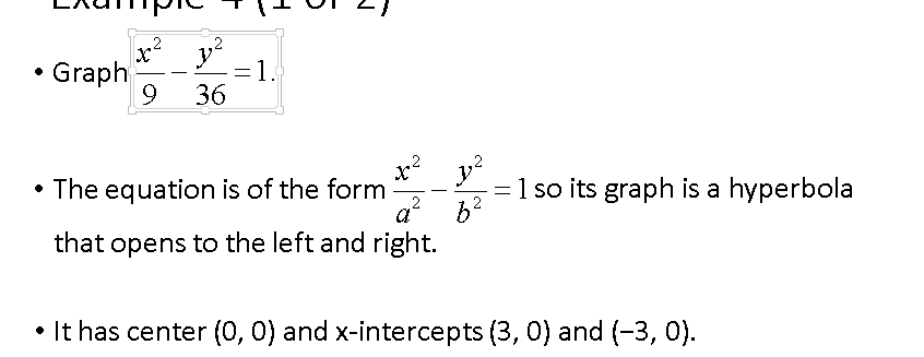
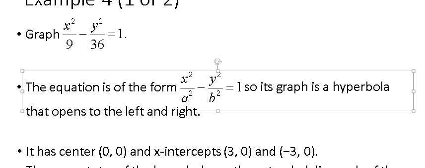
Equations should be on their own line or within a single list item of a list object; "inline" equations should generally be avoided. Math OLEs are separate objects from text placeholders; as such, visually inserting an equation over spaces within a sentence will cause the reading order to be first all the text, then the math equation. There are two ways to keep the reading order correct in an "inline" equation: either put all of the sentence including equation inside a Math object (not recommended), or use separate placeholders for the beginning text, the equation, and the rest of the text, overlapped to appear visually seamless.
Here, tab order is shown going through first the beginning of the sentence (which has spaces added after it to create room for the equation)
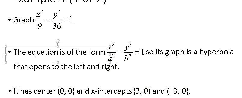 then to the equation
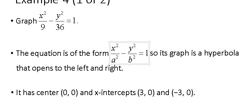 and finally the rest of the sentence in another text placeholder (which has spaces at the beginning to show the text picking up "after" the math equation).

Stepped-out equations
It's not uncommon for slides to show equations "stepped out." That is, when the student first encounters the slide, only the first line of an equation is visible. Authors using animations to hide content need to ensure that users initiate the "stepping" themselves, and can via keyboard (see more at interactive animation).
Equal signs (=) should line up vertically, unless there is a compelling reason not to do so (a trick is to draw a vertical line that you can use to align the equal signs). For non-stepped-out floating object display equations, the equals signs should be lined up using the preference within MathType. For stepped-out equations, each line needs to be manually aligned.
Setting MathType Equations
Keyboard characters that should be used only from within MathType to create a MathType equation:
- Letters
- Numbers
- Minus sign
- Plus sign
- Equal sign
- Comma
- Exclamation point
- Dollar
- Percent
- Less than
- Greater than
These characters must be applied from the MathType toolbar:
- Tilde
- Similar to
- Prime
- Caret
- Asterisk
- Parentheses
- Brackets
- Angle brackets
- Braces
- Less than or equal to
- Greater than or equal to
- Multiplication dot (called the "dot operator", use the smallest of the MathType pull-down choices; using this symbol will also include space on either side of the operator automatically)
Animations
While some parts of animated content can be made accessible, animation should be used carefully. When animations are used to provide meaningful content, they must be made accessible. If this cannot be done, an accessible alternative should be provided.
Cautions About Animation and Flashing Content
Animations can be distracting or difficult to read for many people; in addition, people with vestibular disorder may get physically ill. Screen reader users may attempt to read text that is still changing. For these reasons, have your transitions settle within five seconds.
To Adjust Slide Transition Speed:
- Select the text or object the animation will be applied to
- Activate the Animations tab
- Go to the Advanced Animation pane and select Add Animation
- Select an animation effect such as Entrance, Exit or Emphasis
- Go to the Timing pane
- In the Duration field, enter the length of the animation
- In the Delay field, specify a time less than 5 seconds to play the animation
- Test the results by activating the Play button
Elements that flash or blink too fast can be uncomfortable for some, and can cause seizures for people with photo-sensitive epilepsy. Avoid flashing or blinking text altogether. However, if flashing content must be included, the flashing rate should be lower than 3 flashes per second. If you need to check the flashing rate to make sure it's safe, set a timer for 10 seconds, and count the number of flashes that occur. Divide the number by 10 and make sure the result is less than 3.
Besides the dangers of flashing content, other potential drawbacks may exist with using animation. Animated content is challenging for users with many types of disabilities. When content can appear from any direction, it may be difficult for some users to track what is on the screen. Use animation judiciously and provide an accessible alternative for meaningful animation that cannot be made accessible.
Animation Transitions
Transition animation is text that fades in, flies in, or appears gradually in sections. It can add visual interest to your presentation. If you choose to use transitions in your slides, keep accessibility concerns in mind.
Screen content that appears after a delay may not be available to users of assistive technology. Assistive tech like screen readers will attempt to read the content on the slide when it loads. When some content only appears after a delay, the assistive tech may not recognize its presence. One option is to provide instructions to turn off the transitioning animation at the beginning of the slides.
Equivalents for Audio
If meaningful audio content is part of an animation, provide a text equivalent for users who are deaf or hearing impaired. This equivalent can be provided in a separate file or as a description within the slide text or notes.
Interactive Animation
It is possible to control some parts of animated content, but it needs to be done correctly to be accessible. The option to set a specific trigger on an object to start an animation—like setting it to start after a user clicks text or a shape with the mouse—should be avoided.
The "on-click" option should be used instead of the trigger option. Don't use the Trigger button on the Advanced Animation pane! "On-click" allows both mouse and keyboard activation, and is selected by default in the Timing pane. This is the recommended method especially for slides with stepped-out math equations if the steps can't be separated into individual slides.
It is better to provide users with the option to advance through each animation with a click of the mouse or keyboard instead of automatically showing the animation.
To add On Click to Animation Timing:
- Verify animation effects such as Entrance, Exit or Emphasis have been added to text or objects
- Activate the Animations tab
- Go to the Timing pane
- Select On Click from the list next to Start
An Alternative Approach
Note: THIS IS NOT AN OPTION FOR MATH. DO NOT USE THIS APPOACH FOR MATH. ONLY USE THE ON CLICK APPROACH FOR MATH
Because it may be difficult to make a single animation accessible, it may be useful to break it up into several slides. This is especially useful for animations used to walk through a multi-step process. The animated content can be broken up into steps that can be reviewed one at a time.
- Copy the slide into several additional slides
- Change the objects on each slide to represent the next step of the process
- Set the slides to advance on click and not automatically
Notes for screen reader users
Math Recommendation
Students need not just MathPlayer but also MathType installed (and they must have the 32-bit version of Office, not the 64-bit version). They can download the free 30-day trial from the Design Science page. When it expires, it will fall back to MathType Lite, which retains the fonts and symbols and still allows students to view slides.
Alt text is necessary on all math objects for JAWS users. Because NVDA will read out both the alt text and the MathML equation in Edit/Normal mode, I recommend NVDA users go through slides in SlideShow/Presentation Mode, where only the MathML is heard. Math objects are not included in Outline View, for students who normally prefer it, so for math-containing slides, stick to either Edit/Normal or SlideShow/Presentation Modes.
Tables
Because of this NVDA bug, NVDA users cannot easily and accurately navigate tables. Tables are somewhat accessible in Edit/Normal mode, by pressing Enter or F2 to move the cursor into the table. Arrowing around using NVDA in this way does state which row/column the cursor is currently in. The usual table navigation keystrokes don't work however.
Tables are completely ignored as a structure with NVDA when in SlideShow/Presentation Mode. Instead, the content inside is read out as if each cell were a new sentence, with no indication that there is a table at all.
JAWS 16 meanwhile can navigate tables in SlideShow/Presentation Mode, though only if there's no alt text present (otherwise, the alt text (and only from the Description field) is read out like a text placeholder). For some reason in Edit/Normal mode, moving the cursor from cell to cell announces the cells as graphics.
Table Recommendation
We recommend students use JAWS for PowerPoints with tables. For NVDA users, Edit/Normal mode is the best way to get table information. Students are advised then to be very careful not to accidentally edit the content.
Animations
For stepped animations, in SlideShow/Presentation Mode, it seems NVDA reads all the content within the slide whether it's visible or not. This leaves using the spacebar or other keys that normally advance the slide to be silent as the previously-hidden content is revealed. Turning animations off before using SlideShow/Presentation Mode solves this problem.
For JAWS, leaving animations on and stepping through them in SlideShow/Presentation Mode mostly seems to work okay, except when there are math OLE objects. JAWS users may hear a bunch of animation settings, or the screen reader may seem to get "stuck" on an equation even though visually new content appears. Even turning animations off in SlideShow/Presentation Mode doesn't seem to completely fix this. Sticking in Edit/Normal mode to read slides with stepped animations works a lot better in JAWS.
Animation Recommendation
For stepped animations controlled by keystrokes, we recommend students use NVDA in SlideShow/Presentation Mode with animations turned off or, with JAWS, remain in Edit/Normal mode.
Notes on Converting to PDF
PowerPoint slides can be converted to PDF slides. Be aware that not everything make convert correctly to PDF, so extra work may need to be done in Adobe Acrobat to make sure that the converted slide maintains accessibility.
To make sure as many aspects of your PowerPoint slide remain accessible in the resulting PDF, when following these steps from Microsoft that the options for exporting tags for accessibility are checked in the PDF/XPS dialog box.
Resources


 then to the equation
 and finally the rest of the sentence in another text placeholder (which has spaces at the beginning to show the text picking up "after" the math equation).
